

Responsive Layout Maker Pro 1.1.2746
Responsive Layout Maker Pro 1.1.2746 | 36 MB
Fluid grids, custom breakpoints, draggable elements. Visually design responsive layouts from the content out. The resulting code? Crisp, clean and production ready!
Multiple Configurable Grid Systems
Layout Maker comes with a growing number of integrated grid systems, including the Bootstrap grid. Column counts and gutter widths can be customized for each system.
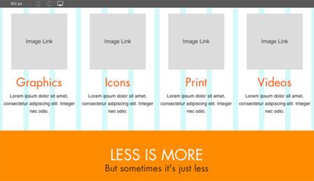
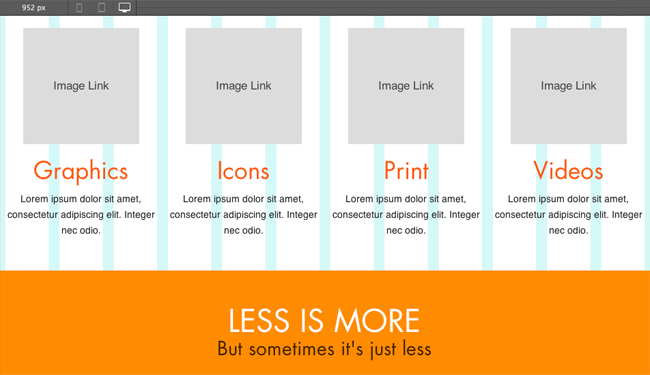
Drag-n-Drop Content Blocks
Design from the content out and tailor layouts around unique content and business needs. Add anything from a paragraph to an input element with just a drop.
Clean CSS + Semantic HTML
No superfluous machine-generated code here. Specify your own classes & IDs, assign semantic tags, and more. Layout Maker keeps everything crisp and clean for easy hand-tweaking.
Custom Layout Designs
Add rows and content containers with a simple click. Toggle column spans, stretch rows, or constrain their widths. You can even use subgrids and container nesting for ultimate layout control — kabam!
Configurable Element Properties
Control paddings, margins, floats, font styles, links and everything else that makes your unique content look its best.
Custom, Content-Driven Breakpoints
Use the built-in viewport slider to view the design at every possible width. Add breakpoints to change column widths, define responsive actions, or tweak margins and sizes to guarantee that the layout is optimally usable on any device.
Browser-Based Prototyping
Wireframing and previewing in an actual browser makes your designs interactive and resizable. No more huge pile of static images to illustrate what a design might look like on different devices. Sweet!
Selector Color Codes
Quickly identify the styles associated with, and applied by, each selector.
And we didn’t stop there
Layout Maker also has mobile-first and desktop-down workflows, multi-page layouts, configurable export options, automatic em conversions, Google Web Fonts integration, advanced grid configurations, and we’re just getting started…
Home Page - http://www.coffeecup.com/responsive-layout-maker-pro/
If Links are broken, PM me! Files will be reuploaded ASAP :)
No mirrors please
No mirrors please